Sunday, 27 September 2009

Pompidou Centre


I remember when I first went to the Pompidou Centre, I was onyl 14 years old with my father. I was just starting to get into the idea of modern art, and upon seeing the Centre I was shocked and excited by the style and design of the building. It had been designed in such a cool and wacky way and had a very loud character to it.

Inside the centre is the most beautiful range of modern art, and if your ever in Paris, it is definitely worth popping in.

Yves Klein


As I am sure you can see from the way Klein works, his style is unusual to say the least. But actually very dramatic, fun and exciting. Yves Klein is an artist who I briefly studied a couple of years ago, but never truly understood his work, or the reason behind his work. New York critics of his time described him as neo-Dada. He is an artist I would like to research into further.  

Sam Winston


Words are as much a part of Graphic Design as images. These are some detailed explorations of the written word by Sam Winston. This work is about the amazing relationship you can create between written language and visual language through design. I was reading through the magazine, 'Grafik' and came across this work, and it inspired me so much. I love the use of the old school pencil being used, and as if the text is being flowed somewhere else unknown.

Tibidabo


Tibidabo is a mountain overlooking Barcelona, and as you can see has some incredible views of the city. To reach the top, I had to take a train, then tram, and then another train. At the top, there is an amusement theme park, which is the oldest in Barcelona, and only until further research did I hear that it contains all of the oldest rides. The view is spectacular and it really is a beautiful place to get away from real life for a couple of hours. 

Dan Flavin


In 2006, I went to the Hayward Gallery in London to see Flavin's exhibition, 'A RETROSPECTIVE'. It truly was astonishing. As I have stressed in so many posts already, but the beauty of this work lies in the simplicity, yet the outcome is so strong. It was, and is probably the first exhibition I have ever been to when I could just sit in the middle of a room and look at the work over and over again, for hours.

YOUTUBE


Well, about as obvious as anyone may suggest. But simply brilliant. I think it is important for me to discuss a website that I use over 15 times a day. There really is every single video you could ever think of!!! When looking at everyone's blogs, I notice how much youtube is to everybody, and how useful it is. I remember when it first came on to the scene, and the idea of putting any video on the website was slightly bizarre but now it is something I really cannot live without.


MUSEU NACIONAL D'ART DE CATALUNYA


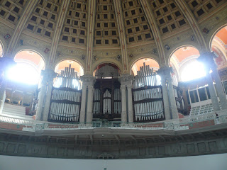
In terms of the view from the museum and the decor of a museum, this is number 1 for me. When you get to the building, which involves either stairs or as you can see an outside escalator, there is the most beautiful view of the whole of Barcelona. The building as you can see is triumphant, and what I love most about it, is the fact that from the outside it is rather old fashioned and when entering, as you can see in the photos, it is very modern and new with small dashes of the old fashioned style being drafted in at points.

The museum itself has a wide variety of exhibitions to look at, pretty much ranging from painting to photography. So there is a bit for everyone, but one should go there purely on the view and just to see the museum's modernity.

Philip Worthington's Shadow Monsters (FRIDAY LATE ANIMATE - V&A)


http://www.youtube.com/watch?v=g0TOQo_7te4

Philip Worthington's grand scale version of Shadow Monsters work was one of many animations to be exhibited at the V&A on One of their special Friday Late shows. These are absolutely fantastic and so clever. You sit in front of the screen making different hand gestures etc and your hands turn into monsters, saws, weird objects. it was definitely the highlight of the show, and if you ever get a chance you must have a go. Simply brilliant.


Alan Cristea Gallery


This gallery is situated on 31 &34 Cork Street. It is a lovely small gallery that is just off Green Park. During holidays, one of my favorite past times is visiting galleries and museums. This area of London is wonderful for small, privately owned galleries, along Cork Street, Albemarle Street etc. The reason I have highlighted on the Alan Cristea Gallery, is that when I first visited this particular gallery, there was a wonderful show, exhibiting the artist, Julian Opie's work. It is a shame I am not able to show you quite how some of the images work, but it is very simple and clever, and uses the light. When you walk around the images they change, from where you are looking at them from. The first image is called, 'This is Shahnoza 1' (2006) 'His work involves the reduction of photographs, and short films into figurative reproductions' - (created using computer software)

Christian Boltanksi


The way he projects his work is so cool, and I love the way he uses light to make his work powerful, strong and scary. I think the fact that the faces are all from the obituary paper is slightly messed up, and that maybe there are a couple of screws missing in his head, yet none the less it is probably the extremity of his work that makes it so powerful. His use of faces expresses what he is trying to note within the contrast between the light. Maybe he is shining light on dead people in a way to suggest that they still have light shining on them in some way.

Wonderland


I first came across the magazine 'Wonderland' in April 2007. It was clearly a fairly new and innovative magazine that represented the cool and arty trends and fashions. What I enjoyed is that it wasn't just photos on every page, like perhaps, 'POP' (that is also brilliant!!), yet also had explanations of the current style and more than just clothing line and fashion.

The color used through out the magazine is dramatic, and the way the photos have incorporated paint and make-up on the models creates a certain ambience.

2012 Olympics Logo


This logo has had much publicity, particularly when it first arrived onto the scene. 'Our emblem is simple, distinct, bold and buzzing with energy. Its form is inclusive yet consistent and has incredible flexibility to encourage access and participation. It can communicate with anyone from commercial organisations to kids playing sport.'

At first, I was one of the few people that actually quite liked it. I could sympathise with people's views, but in terms of being noticed, becoming famous, and the main issue of being memorable, I think it is a great design. As the agency has already said, it is 'simple' yet we can relate to it, and I think after a couple of months of discussing the emblem, it has actually brought a huge excitement about the Olympics.

'It feels young in spirit. Full of confidence, certainty and opportunity. Not afraid to shake things up, to challenge the accepted. To change things.'

Saturday, 26 September 2009

The Book Of Cities


I have always wanted the opportunity to travel the world, and it is pathetic to think of the few places I have ever seen bar the UK. I was given this book by a friend, and it really has the most amazing reviews for each city it suggests. The book tries to get across the importance of each city having a unique character to it, ('despite the prevalence of global brands and chains'). I highly recommend it, even if just to educate yourself slightly further about some of the worlds greatest cities. Although I fear after reading it, you may end up booking flights all around the world.